Inside/Outside
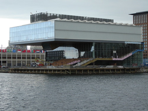
There is a pretty interesting article by architectural critic Philip Nobel in the newest Metropolis about the ICA in Boston (which I've also posted about before). 
the ica when it was under construction
Now, obviously a critic is paid to be critical, so the article is a little down on the building. His biggest complaint seems to be about the way the building relates to its surroundings, which is a valid complaint considering the building is currently surrounding by nothing. It is a little silly though to complain about planning when there is already a plan in place and beginning construction.
Generally though, what I get from Nobel is that he's unhappy with the way the building is oriented. It turns it's back to the city, with it's harbor-side being the photogenic part and the interior most of its most interesting (architectural, philosophically) feature.
So here's my question: Is it important for every building to relate at street level to the city? Can some buildings work better (especially symbolically) relating at a skyline (or seashore) level? And, for a public building like a museum, is the interior (which, in the ICA, is an intense experience) perhaps the more important feature?
I'd love to hear ideas. For pictures of the museum check out my previous post on the subject or my flickr account.
**** I happened upon this quote today from the architect (Ricardo Scofidio) and thought it was pretty interesting:
"We began the project with the assumption that architecture would neither compete with the art nor be a neutral backdrop. It had to be a creative partner. The first step was to reconcile the paradox: the museum wanted to turn inward; the site wanted to turn the building outward. The building had to have double vision."


6 comments:
you can't make something photogenic from the street side if the only realistic vantage point is from 75 feet away. that might look a little ridiculous if it faced the street. i don't know what the street side looks like.
it reminds me of the new guthrie minus ikea
There is one photo in the Nobel article that shows it from the back. I'll try and find a better one (or go take one myself).
When I first saw the ica, the first thing i thought of was ikea. I think they had a coffee table that looked a lot like it a couple of years ago.
Some good questions. I will preface this by saying I haven't visited the building and am operating from a series of drawings and images of the project. I don't think in the case of this building the distinction between "street and harbor" or "front and back" is as clear as all that.
My perception is that it is a building that is always perceived from an oblique or slanted view. It's entrance attempts to pull from the street into the site itself. I don't really buy the whole folding thing, that has been used to describe it, as much as this idea of the slanted ground plane organization within the building. This creates the possibility for what I think this building is really about (of course not having seen it this is just speculation, kind of like rating a film on its trailer) anyway it seems to be about a certain cinematic approach to views of the city, wharf etc... Exterior views from the building are "widescreen" formatted and viewed from angles that reinforce their dramatic effects. At least those are the views anyone who photographs the building feels compelled to show.
I hate the huge HVAC units on the top by the way.
jsj.
Yeah, no kidding about the HVAC. They were even more prominent during the construction.
Great post!
One way to look at it could be - when is it acceptable for a great building to not have have a strong orientation to the street?
I'm not personally familiar with the building (although I did catch a short documentary on the construction on the building on TV) but I have a general understanding of the subject area's overall redevelopment plan.
If I remember correctly, there is a lot of room for redevelopment in the area (you note that it is surrounded by "nothing").
Would you generally agree that this building would probably be a better catalyst for future redevelopment with a strong street presence?
I'm not disagreeing that the museum experience often happens "inside" the walls. But I don't think that precludes from being approachable from the exterior (or at least holding that standard).
I mean, how bad is it, really? What would you have done differently?
The building orients itself relative to the water side. So the only way that you can approach it is from the "back" which is basically a blank wall made of tinted glass. What's kind of interesting is that, because you are so used to seeing the "front" photogenic side, it's actually a little hard to find the museum, even though there is nothing around it. It looks both smaller and less interesting then you would have assumed.
I think it's definitly supposed to be a catalyst for more development (which is also the stratagy that Boston used when it developed the back bay), and, given that there is only so much waterfront property open in boston, I'm sure it will get developed sooner or later, however, I am starting to hear about some condo projects getting dumped due to the economic downturn in real estate. It'll be interesting to see what happens.
Post a Comment